A local plumber calls you at 9 PM asking for a landing page to run a Facebook ad by tomorrow morning. Ten years ago, that request meant an all-nighter.
Today, it means opening a laptop, describing the offer, and publishing a real page before the coffee gets cold.

Speed used to mean sacrificing quality. That trade-off is mostly gone now.
A well-built lead generation landing page can go from idea to published in under an hour, without cutting corners on design, copy, or the local seo signals that help a page actually get found.
This guide walks through how to build a fast, focused lead gen landing page for a local client, what makes it convert, and how to know when it needs to grow into something bigger.
Key Takeaways
- A focused lead gen landing page built around one offer converts better than a general website page.
- Fast build workflows now let you launch a professional local landing page in hours instead of days.
- Tracking form data and visitor behavior tells you exactly what to fix in the next version.
What A Local Lead Gen Micro-Site Is Designed To Do
A local lead gen micro-site has one job: turn a visitor into a lead. It strips away the distractions of a full website and focuses on one offer, one audience, and one action.
Whether the traffic comes from ppc campaigns, retargeting, or organic search, the page needs to hold attention long enough to collect contact details from qualified leads.
The Difference Between A Homepage, Sales Page, And Lead Capture Page
A homepage tries to serve everyone who lands on it. It links to services, about pages, blog posts, and contact forms, which spreads attention thin.
A sales page pushes toward a purchase decision, often with pricing and detailed objection handling. A lead capture page does neither.
It exists to collect a name, email, or phone number in exchange for something of value. There’s no navigation menu pulling visitors away and no competing calls to action.
Everything on the page points toward one form.
Choosing One Offer For One Audience And One Traffic Source
The biggest mistake with landing pages is trying to please too many people. A page built for homeowners searching “emergency plumber near me” should look and read differently than a page built for a Facebook ad targeting new homebuyers.
Matching the offer, the audience, and the traffic source keeps the message tight. When those three things align, lead capture rates climb because visitors feel like the page was made just for them.
When A Micro-Site Is The Right Fit For A Local Client
A micro-site makes sense when a client wants to test a new service, run a seasonal promotion, or launch a location-specific campaign fast. It’s ideal for short-term pushes: a spring HVAC tune-up special, a new dental office opening in a neighborhood, or a limited-time consultation offer.
If the client needs ongoing content, blog posts, or multiple service pages, a full website is the better long-term answer. The micro-site is a sprint, not a marathon.
The Overnight Build Workflow
Building a landing page overnight isn’t about rushing sloppy work. It’s about using a repeatable process, from gathering the offer details to publishing a mobile-friendly design, that removes the guesswork and lets an ai-powered design tool handle the heavy lifting on layout and copy.
Start With The Offer, Audience, And Conversion Goal
Before opening any landing page builder, write down three things: what the client is offering, who it’s for, and what action counts as a win. This sounds basic, but skipping it leads to vague pages that try to do too much.
A five-minute call or a short client questionnaire usually gets you everything needed. Ask what makes this offer different, who the ideal customer is, and whether the goal is a phone call, a form fill, or a booked appointment.
Turn A Client Brief Into A Page Outline And Content Blocks
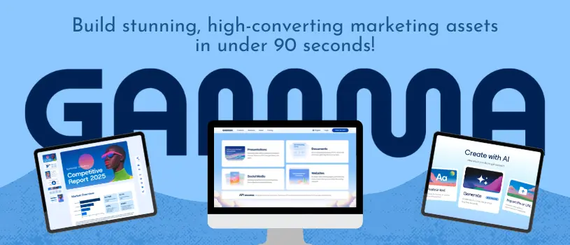
Once the offer is clear, break it into content blocks: headline, hero section, benefits, social proof, form, and closing call to action. Tools like Gamma can take a short prompt describing the offer and audience and generate a working layout with these blocks already in place.
A typical outline for a local service page looks like this:
- Headline and subheadline stating the offer
- Hero image or short explainer video
- Three to five benefit statements
- Testimonials or local trust signals
- Lead capture form
- Closing CTA with urgency or incentive
Create A Consistent Visual System Without Slowing Down
Consistent branding, typography, and visual hierarchy make a page look professional even when it was built in a few hours. Stick to the client’s existing colors and fonts if they have them, and default to two or three font sizes max to keep the layout clean.
Landing page templates help here because they already have visual hierarchy baked in. The goal is a page that looks like it took a week, even though it took an evening.
Publish, Review, And Share The Page For Approval
Once the draft is built, send it to the client the same way you’d share a pitch deck or client proposals: as a link, not a screenshot. This makes feedback faster and edits easier to track.
Many freelancers now use the same builder for presentations, documents, and landing pages, which keeps the workflow familiar across projects. A quick client sign-off, a few tweaks, and the page is ready to go live.
Conversion Elements That Earn Local Leads
A landing page can look great and still fail to convert if the fundamentals are off. Headlines, hero visuals, forms, and trust signals all work together to move a visitor from curious to converted.
Each piece needs its own attention before the page goes live.
Write A Benefit-Driven Headline And Clear Value Proposition
The headline is the first, and sometimes only, thing a visitor reads. A benefit-driven headline tells them exactly what they get, not just what the business does.
“Same-Day Roof Repairs in Austin” beats “Austin Roofing Company” every time. The value proposition underneath the headline should answer the unspoken question: “why should I care?”
Keep it to one sentence and make sure it matches the ad or search query that brought the visitor there.
Use Hero Visuals To Make The Offer Immediately Understandable
A hero image or short explainer video should show, not just tell, what the offer is. A photo of a finished bathroom remodel communicates faster than a paragraph describing the same thing.
Visuals also carry emotional weight. A warm, local photo of a real team or job site builds more trust than a generic stock image, especially for service-based businesses trying to earn local trust.
Build A Low-Friction Form And CTA Path
Every extra form field is a chance for a visitor to abandon the page. Ask only for what’s needed to follow up, usually name, phone number, and maybe service type.
For bigger asks, multi-step forms can break the request into smaller, less intimidating steps. The cta button deserves attention too.
Cta copy like “Get My Free Quote” outperforms generic text like “Submit” because it restates the benefit one more time.
Add Local Credibility Before Asking For Contact Details
Testimonials, reviews, and case studies placed near the form give visitors a reason to trust the business before handing over their information. Local client logos or a short list of neighborhoods served can add another layer of social proof.
Basic trust signals matter more than people expect. Visible contact information, an ssl padlock, and simple security badges near the form all reduce hesitation at the exact moment a visitor is deciding whether to submit.
Match The Lead Magnet To Buying Intent
Not every visitor is ready for the same offer. Matching the lead magnet to where someone sits in their buying journey, from just browsing to ready to book, keeps conversion rates high and keeps the leads that do come in more qualified.
Use Downloadable Resources For Early-Stage Interest
A guide, checklist, or free ebook works well for visitors who are still researching. These downloadable resources ask for less commitment, usually just an email address, in exchange for helpful information.
A local accountant might offer a “Small Business Tax Checklist,” while a landscaper might offer a “Spring Lawn Prep Guide.” A whitepaper can work too, though it tends to suit B2B audiences more than local consumer services.
Use Demos And Consultations For High-Intent Prospects
Visitors closer to a buying decision respond better to a demo request or a free consultation. These offers ask for more, usually a phone number and a scheduled time, but they attract people who are already close to ready.
A home security company offering a “Free In-Home Security Assessment” is targeting someone actively comparing options, not someone just starting to research.
Use Waitlists And Newsletter Signups To Validate Demand
For a new service or location, waitlists and newsletter signups help test demand before fully launching. This works well for founders who want to run and validate ideas quickly before investing in a full buildout.
Interactive elements, personalization, and dynamic text replacement (like swapping in a visitor’s city name automatically) can make even a simple waitlist feel tailored. This tends to boost signups without adding real complexity to the page.
Measure Lead Quality And Improve The Next Version
Publishing the page is the start, not the finish. Connecting form data to a crm, watching analytics, and running small tests over time turns a one-off landing page into a reliable local lead gen local seo asset that improves with every campaign.
Connect Form Submissions To CRM And Fast Follow-Up
Every lead capture form should feed directly into a crm, even a simple one, so no lead sits unanswered. Pairing that with a confirmation email and a nurture sequence keeps the lead warm while a human follow-up gets scheduled.
Speed matters here more than most people realize. Leads contacted within minutes convert at noticeably higher rates than leads contacted the next day.
Track Conversion Rates And Visitor Behavior
Basic analytics, including google analytics, show how many visitors convert and where they drop off. Heatmaps and session recording tools go a step further, showing exactly where someone scrolled, paused, or gave up before finishing the form.
A conversion rate under 5% for a cold traffic campaign isn’t unusual, but a well-matched offer and audience should push that number higher over time.
Test Messaging, Form Friction, And Campaign Alignment
A/b testing headlines, form length, and cta copy uncovers small changes that add up to real gains. Landing page optimization is rarely one big fix; it’s usually a string of small wins from landing page best practices applied consistently.
Checking that the page’s message matches the ad or seo keyword that drove the click is one of the fastest ways to spot a mismatch causing high bounce rates.
Know When To Move Beyond A Rapid Campaign Page
A fast-built micro-site is awesome for testing an offer, but it does have its limits. Once your campaign proves itself, it’s often smart to upgrade to something more permanent.
That could mean a full page on WordPress, a dedicated LinkedIn campaign, or a more robust CRO tool like Unbounce or Instapage. Growing pains are actually a good sign—they show your quick page did its job and it’s time to level up!
Freelancers and agencies juggling several of these projects can build landing pages and client sites with Gamma. This keeps your whole workflow, from proposal to published page, all in one handy place.